Michael C. Carlos Museum
Improving the user experience of an educational center’s online connection to the community.

Project summary
The Michael C. Carlos Museum at Emory University had a problem. Their current website was not only outdated in its design and technology, but it was no longer serving as a good representation of the museum and all that it had to offer the community. I addressed the issues The Carlos faced via three primary avenues:
Simplification of the websites Information Architecture
Building webpage structures that prioritize visual content
Modernizing design and brand styles for The Carlos website.
Project details
2018
Michael C. Carlos Museum
Design System
UX Design
UI Design
Simplifying the website
Before offering solutions I had to get a good understanding of the current state of the Carlos website; you can’t fix anything without first diagnosing what is broken. Research lead me to discover some important insights about what was failing in the current website.
Percent of total pageviews


Exit rate of each webpage

Reviewing the data
Challenges
The architecture and navigation of the website had become unintuitive and endless. We were finding content 4—6 levels deep that current web administrators didn’t realize were still live and accessible, hidden behind triple nested navigation menus. While the site map demonstrated a large breadth of content, the Analytics data showed that the vast majority of it was never being seen. The majority of users navigating to visiting info and little else.
Discovery
While there are multiple points of interest, the primary take-away from this “quick dive” showed how little of the website was ever explored or utilized by users, in-spite of continually updated content.

2 min
Average session duration

2–3
Average page duration

73%
of visitors did not have
a returning session.
Audit of Site Map

Proto-Personas
Challenges
The Carlos team did not have a target user group in mind. However, The Carlos staff are intimately involved with their visitors and felt able to accurately provide an overview of their regular and target audiences. I used their insights to build proto-personas to help drive understanding of the project’s needs forward
Discovery
Working with The Carlos staff we identified two persona archetypes, Laura Rice, a visiting resident, and Amanda Gray, an educator, as our target users. Unfortunately, due to budget and time concerns, I was not able to interview users directly.

Laura Rice
Visiting Resident
I haven’t visited The Carlos in a while and am wondering what the current special exhibitions are. If it is something that interests me I’ll probably visit this weekend, but I don’t remember the hours the museum is open or cost of admission.

Amanda Gray
Educator
I am teaching my students on a subject related to the current exhibit, and I think it would be beneficial for my students to see it. I need to know how I can arrange a class tour/visit, how long it would take, and at what times it would be available.
Simplified
The solution to The Carlos biggest problems was clear, the new website had to be simpler, easier for humans navigate, and sensible for staff to update. I created a new site-map with a “content first” approach, one that emphasized the new programs and event’s that occur at The Carlos weekly and relied on CMS to filter updates with a single post from the staff.

Competitor Audit
Because the goals of this project amounted to a complete overhaul, I first wanted to gain an understanding of what conventions other websites in the same space were using, to “stand on the shoulders of giants.”
Discovery
Visiting information is always up front and easy to access.
Priority space is given for feature content, not just current exhibits but, perhaps more importantly, for special events as well.
Event information often has pages held separately from the calendar, while also duplicating that information on the calendar.
Many websites opt for a “card” system, due to the modular nature of the content and the frequency of updates.
All webpages include CTA’s to subscribe to future newsletters.
These similarities provided a baseline of design options for how to structure a website for The Carlos that would meet the needs of their audience.


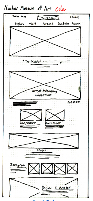
Wireframe Structure
Reviewing all of the information gathered in the project thus far revealed that what The Carlos Website needed was clarity. With that focus in mind I developed a content structure and layout that communicated to visitors the breadth of their community involvement and communicated to educators the multitude of opportunities for K–12 classrooms and University students.


Modernizing Design Styles
Now several years old, an investigation of the original website UI quickly reveals a design style that is outdated in its color and typography, with minimal usage of photography in ways that does not satisfy the visual appetites of modern audiences. The combination of these elements furthered the old websites inability to communicate the deep cultural influence of The Carlos. Creating the perception of a museum that was out of touch with little to offer.
Challenges
The primary challenge was defining a visual style that The Carlos team felt was unique to them, without creating anything too far removed from their parent organization, Emory University.
Discovery
Experience is Important, Experience is Personal, History is Physical. Expressed primarily through a focus on photography, these guiding principles drove the focus of the UI, while creating a design system that fit under the Emory umbrella and would be manageable by The Carlos staff.
Grid
The Carlos website design has been created with 3 responsive breakpoints

Colors
The Carlos website is designed to use two primary brand colors as accents for interactive elements.

Typography
Typefaces used are in compliance with the Emory University brand, and help The Carlos fall under that larger umbrella. Type sizes are chosen based off of a “Perfect fourth” scale.

Accessibility
All type color combinations on The Carlos website must pass WCAG AA standards of 4.5:1. In the table below are approved color combinations.

Photography
The Carlos website design was developed with one goal in mind; to provide space for photography that expresses The Carlos experience and it’s collection Items.

Experience is Important
The Carlos is not just a stale collection of old stuff. The Layout of the museum creates a living exhibit that provides a sense of life within history.

Experience is Personal
The Carlos is about people. The Purpose of the museum is to bing history to people and make it real “…in order to provide unique opportunities for education and enrichment…”

History is Physical
The Collections on Display are real, physical, objects that visitors can get close to and even touch. It’s possible to see all the minute details not possible in museums where items might be roped off.
Modular Content
Challenges
The functional needs of the website lended itself well to the card UI pattern, however there were design conflicts with the goal to focus more on photography, the kind of photography The Carlos team would be able to use and maintain, and the supporting text.
Discovery
The solution was a modular card system that allowed for varying levels of content attached to an image.
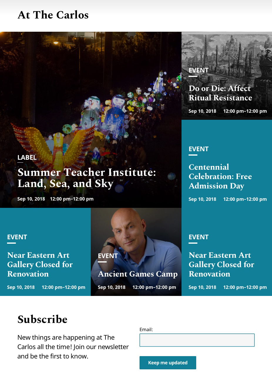

Label
Use for content links within a grid, where no description is needed
Title/Headline
Use for content links that require a description, preferably where a max of 3 are presented.
Date & Time
Use for content where the image presented is of greater importance than the text, especially with objects.
Image or Color
Use for content that requires a description and the text content is more important than the image.

Adding Description
In some instances, a description is added under the Compact Card link. The description is top-left aligned and the card should resize to accommodate, however the maximum size of the card should be no larger than 554px.

Image Focus
Use for content where the image presented is of greater importance than the text, especially with objects.

Copy Content Focus
Use for content that requires a description and the text content is more important than the image.

New Experience
The cumulation of simplifying the architecture, prioritizing visual content, and application of a modern design system compounded into a website that revitalized The Carlos web experience into one that communicated all that the museum had to offer the community.


Impact
Now several years old, an investigation of the original website UI quickly reveals a design style that is outdated in its color and typography, with minimal usage of photography in ways that does not satisfy the visual appetites of modern audiences. The combination of these elements furthered the old websites inability to communicate the deep cultural influence of The Carlos. Creating the perception of a museum that was out of touch with little to offer.
Feedback
“The new page so much easier to use. I can actually find out what’s going on at the museum now, and I’ve even been able to add the events to my calendar.”
— Jessica, Mellon Conservation Fellow
“The navigation has changed, but it was easy for me to find what I was looking for. It all made sense.”
— Ana, Educational Programs Assistant
"It is stunning! What a terrific tribute to our outstanding collections. The site is highly engaging and does a great job of showcasing the exciting programs you’re offering."
— Christa Acampora, PhD, Deputy Provost for Academic Affairs
What I’ve Learned
As my first time leading a redesign for a website of this scale the importance of working collaboratively with clients when making big decisions really paid off. Because decisions were discussed and made together, as opposed to a “choose one of three” approach, allowed the client to buy into design decisions before they’re even created.
Using an Atomic design approach, and thinking in terms of a Design System from the beginning, streamlined the creation of webpage designs from wireframes and the building of prototypes.
What I Would do differently
As my first time leading a redesign for a website of this scale the importance of working collaboratively with clients when making big decisions really paid off. Because decisions were discussed and made together, as opposed to a “choose one of three” approach, allowed the client to buy into design decisions before they’re even created.
Using an Atomic design approach, and thinking in terms of a Design System from the beginning, streamlined the creation of web page designs from wireframes and the building of prototypes.
Better focus on meeting brand and visual design goals, missed a request for portrait photography support in the design.
More consistent progress baked into the project timeline, with room for design exploration.
Better collaboration for critique from other designers
Actual UX Research, talking to users and testing prototypes with users.
In the future I would prefer to work with a developer from a much earlier stage. Unfortunately, due to requirements by the client and availability issues this website followed a Waterfall development approach. As such, there have been complications with development and implementation occurring on time and too spec.
I’ve also realized that a prototype via design services like Invision, is no substitute for the truly responsive nature and needs of a coded webpage in the browser.


Currently Reading
Binging various litRPG