Michael C. Carlos Museum
Improving the user experience of an educational center’s online connection to the community
Project summary
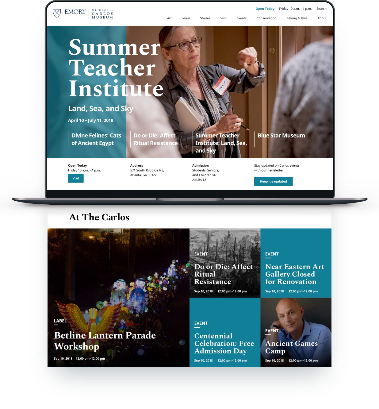
As the UX designer at Times 3, I was responsible for the creation of a new website for The Michael C. Carlos Museum at Emory University. Their current website was not only outdated in its design and technology, but it was no longer serving as a good representation of the museum and all that it had to offer the community.
Project details
2018
Michael C. Carlos Museum
Design System
UX Design
UI Design
Focused on feature events
First and foremost, the design of the website had to ensure that visitors could see and understand the full breadth of activities and events The Carlos regularly provided. This is partially achieved via a homepage that presents the current or upcoming events, classes, exhibitions.


“The new page so much easier to use. I can actually find out what’s going on at the museum now, and I’ve even been able to add the events to my calendar.”
— Jessica, Mellon Conservation Fellow

Navigate Visiting Information
The Carlos serves a wide range of visitors, and as such need to provide several group specific details. We solved this issue through a visiting section that is simple to navigate; for visitors to find the specific information they require.
Modular Content
In order to accommodate varying needs and potential requirements for the websites content, a card system was concepted that could be adapted to offer more or less information and to function with or without photography.


Image or Color
Use for content that requires a description and the text content is more important than the image.

Adding Description
In some instances, a description is added under the Compact Card link. The description is top-left aligned and the card resizes to accommodate up to a maximum.

Image Focus
Use for content where the image presented is of greater importance than the text, especially with objects.

Copy Content Focus
Use for content that requires a description and the text content is more important than the image.

Readable content
Final content pages are designed to be uncluttered and pleasantly readable experiences. These are pages that Carlos staff creates to detail events, exhibits, and classes or to provide long form content on objects within the exhibit and their history.

Easy on the Staff
An important point for this website is the acknowledgement that content would be updated by already busy Carlos staff. The website structure and CMS was designed to ease this burden, providing minimal management need. Creating one new content page automatically creates a corresponding card on related landing pages.


Every story has an ending
Following through on meeting the websites goals, each page ends with an opportunity for visitors to stay informed, to see more of what The Carlos has to offer, and a way to navigate to the museum itself.
"It is stunning! What a terrific tribute to our outstanding collections. The site is highly engaging and does a great job of showcasing the exciting programs you’re offering."
— Christa Acampora, PhD, Deputy Provost for Academic Affairs


Currently Reading
Binging various litRPG