Portfolio Center
Helping find a way to encourage live conversations.

Project summary
Verb was concepted by a team of three designers who set out to find ways to rebuild personal connections, using the very same smartphone that seems to be breaking them.
Recognizing a problem
As designers living through the rise of social media and mobile technologies, but with memories of a time before high-speed internet, we were very aware of growing levels of disconnection among our peers. Setting out to discover the truth of our concern, we identified research that made one fact quite clear; We are losing touch with how to have real conversations and stay connected without social media.
Some Facts
91%
of US adults own a smartphone
82%
say phone use interrupts conversation
92%
believed technology harms face-to-face communication
Nomophobia is real and over 60% of American adults have a fear of being away from their phones.
— Psychology Today
Additional notes
1
Mobile Apps are becoming the new conventional way to meet people and socialize
2
Even when people are together, they are connecting with others
via social media
3
Putting away mobile devices in social settings is no longer the social norm
“I think technology impedes our ability to interact with people face to face.”
— Elon University Student
Our thinking
Social media has led to an “alone together” culture
People spend more time “communicating through a device than in person
Young adults especially struggle to acquire conversation skills in the modern environment.
Even in person, people will reach for personal devices to connect with others; dividing attention.
Millennials are starting to yearn for authentic connections. Intimacy without distraction.
desire to remain “always on”
desire to disconnect
How can we bridge the gap between offline intimacy and online information?
Big Idea
Instead of “fighting” these trends, what if we found ways to use them and encourage face-to-face conversations?
Concept
Because our goal was to promote in-person conversations using the same digital systems and devices already being used we settled on a mobile application as our primary tool.
Defining Information Architecture
From this point in the project it was my responsibility to define the apps structure and how it would function. My first step towards creating the Verb app started with identifying all the components the app required, and understanding how they relate to one another.
Wireframes
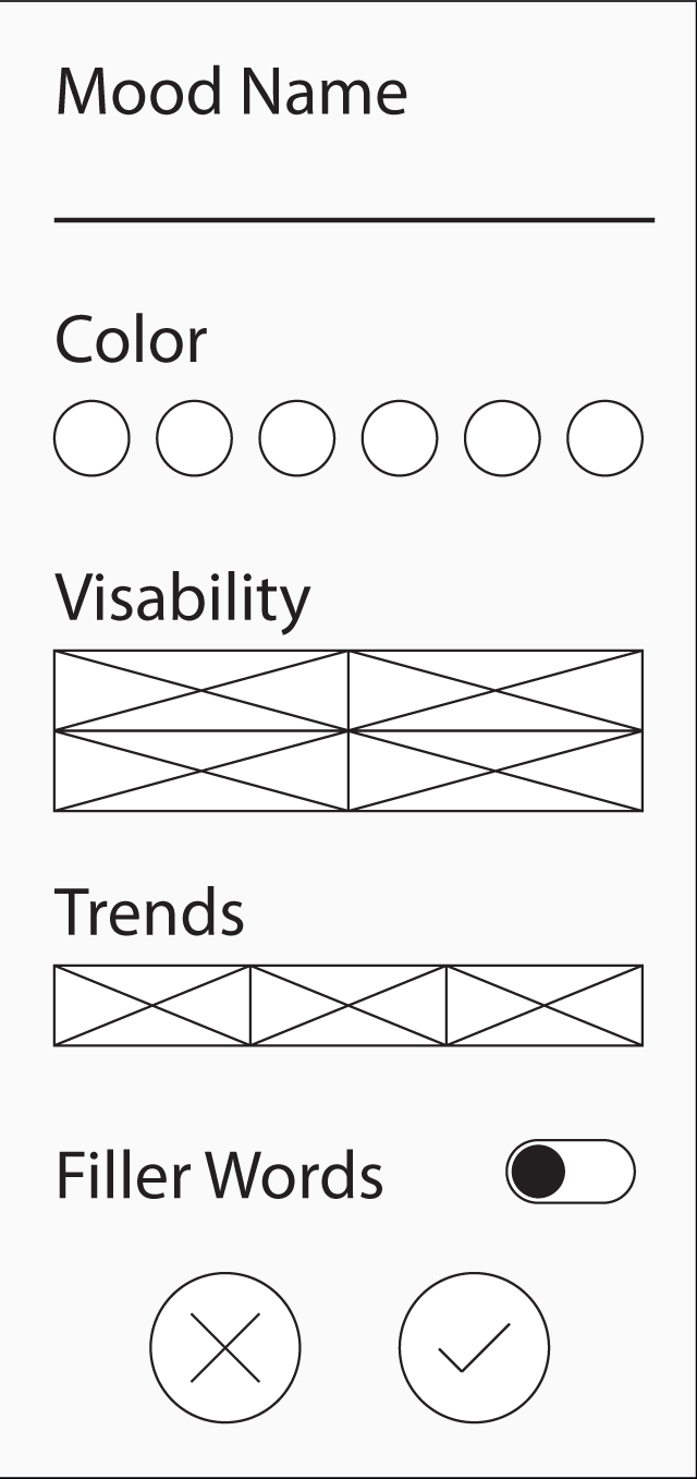
The IA was then used to inform the content needs for each screen of the app, with which layouts and interactions were explored through wireframes.


Bringing it all together
Upon finalizing the brand, color, and style directions provided by the rest of the team. I then designed the final high-fidelity mockups of the application concept.


Presenting the idea
While finalizing the design of the app itself, the team also created a video we could use to present our ideas for the app, and how we imagined it functioning.
Recently Read
Story: Substance, Structure, Style, and the Principles of Screenwriting
by Robert McKee


